Portfolio Version 1

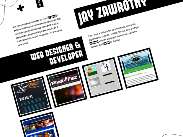
This was my first official portfolio design before replacing it with this one. It was made with the same PHP framework I built Xugo Studios on. I went a little expirimental and used the CSS3 rotation property to make it stand out and add some edge to the content. From doing that I gained some interesting research wisdom:
- When text is rotated some people read it normally and others need to tilt their head.
- Rotated text is a pain in the butt when trying to make a consistent experience between desktop & mobile devices.
- If you do rotate content, rotate it < 15 degrees.
- Rotating your content gives you very strong but opposing reactions