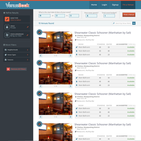
VenueBook Search Redesign

This was designed for VenueBook.com, we kept the structure the same as last time but focused on stronger aesthetics making a more careful use of color, whitespace and typography to make the design more fun and easier to understand.