Ok, so, where to begin? Ah! The client. The client wanted to try something different with their site which is applying a russian constructivist theme which is sort of like Shepard Fairey's work but more like the original style made way back when.
I'm working on this site under the company I co-own called Xugo Studios, LLC with my business partner Steve Gallant.
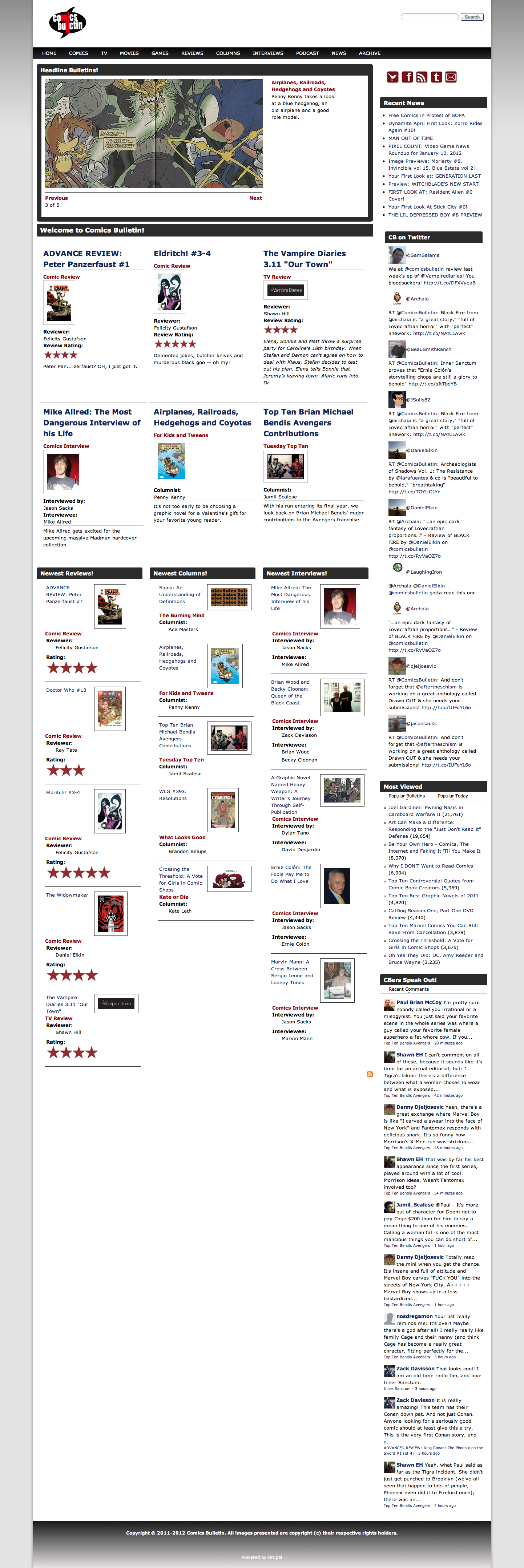
The issue they had with the current design is that it was a bit sterile. There was system, structure but no expression. The design works but it doesn't respect the content, mainly it's value to the users. So our goal is to make a design that creates a personality from which their users can identify with but not over-power the content
So without further ado:
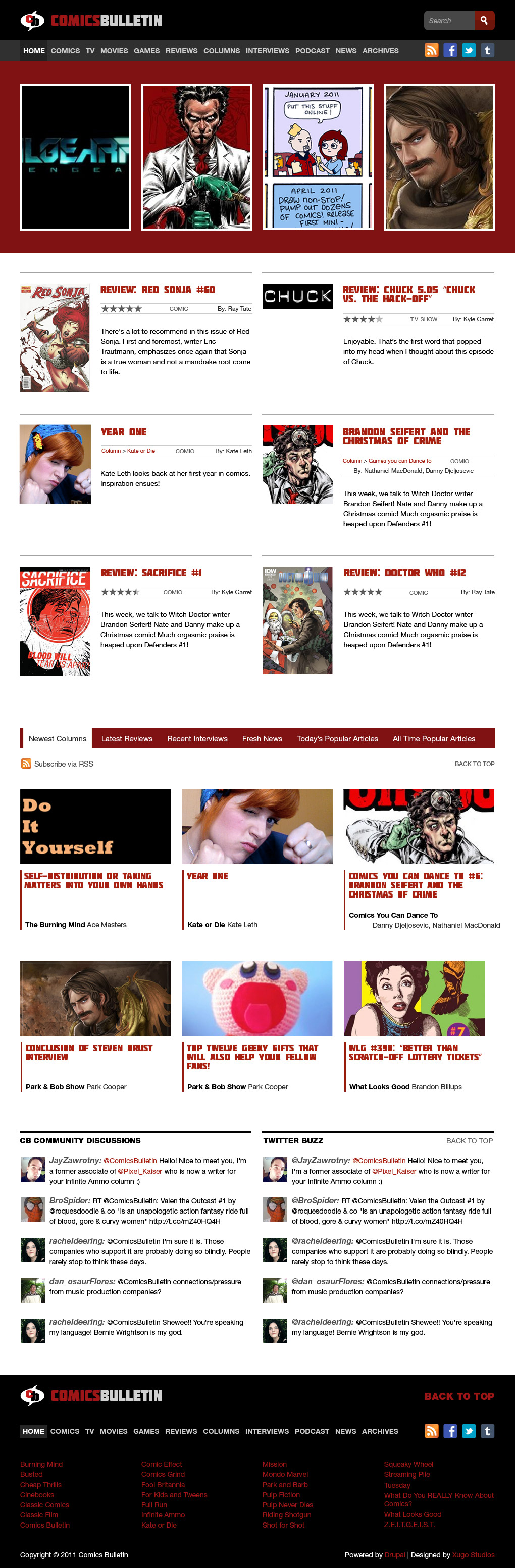
Design Breakdown
Now I want to discuss some of the thought process & decisions that I made to get to that result. I want to do this with some future projects as I feel the story behind them never get told. While the work should hopefully stand on it's own I think context for design decisions are pretty interesting.
Colors
Red, black, grey, and white. Classy colors. Red is an energetic color so I wanted to find a shade that had that sense of russian constructivism in which it needs to be both powerful but stable.
The Logo
The client requested we more or less use the same logo. I was fine with that as it was a pretty interesting logo. Uses a nice condensed typeface and visually resembles the name & content in an identifiable way.
However, the logo on their original design was a bit unwieldy and having two versions one short and one long kind of hurt in the long run since the audience that sees one version may not recognize the other, which is sort of the whole point of a brand. Having said that, I though their shorter logo was certainly usable and offered a nice single-logo solution to use through out the site. I did however add in some type to the right of it the reason I did this was to really make it clear that this is ComicsBulletin, I want that to be one of the first things both users & search engines see.
The typeface will be described in a following section.
Grid
If you take a look at their current design pictured above, the content doesn't have a very strong flow to it. You sort of move up & down and left & right to the sidebar and back then down again and well, not something you want to do with your users. If all they can do is scroll down to see more content it's more likely they will scroll down to do so.
So to really create a nice visual flow to the content sections I used a 16 column 960 grid, this limits the width of elements to be equal to anywhere between 1 and 16. Because there's such a limit it forces me to use the available horizontal space more intelligently than when having the freedom to size and place things anywhere.
Additionally, I also used a baseline grid so everything is aligned vertically up and down the mockup by intervals of 20px. Applying grids to a design really helps all the visual elements work together in both a subconsciously-enjoyable and mathematical way.
Hierarchy
This is one of the most fundamental pieces of quality design work. You need to organize elements via importance to guide the user through the site. So with this titles are large and red, body text is black and smaller, while interactive elements are also red.
I find using 14px as my base font is generally a good body-text size. It makes it easier to read from a distance along with allowing me to make secondary content 12px which is still pretty comfortable to read. At least given the demographic.
Layout
For the layout I was originally planning on including a sidebar but as I looked at the original content on the site and critically examined the current ComicsBulletin site, I felt a sidebar just wouldn't make anything better. I questioned why the content in their current sidebar really needed to be on the side of the main content? It doesn't really compliment it, and keeping it makes it unclear how a user is supposed to "read" the site.
I thought about the sidebar content and realized there shouldn't be any harm in placing it at the bottom of the site. The reason is the content in there is mostly useful for current users. People who are already familiar with CB and have already been to the site before. Thus the main content is above it and is the first thing a new user will see.
Then there's the matter of the main content. I found it could be divided into two sections, top content, which is content individually selected to really put ComicBulletin's best foot forward. I felt this was a wise decision on the current management's part as it allows them to really give new users a great way to get familiar with the best their site has to offer.
The second type of content is more or less everything else. I asked the client what their most popular content was in which they responded with their columns. Since CB handles many different mediums besides comics they created columns, small groups of people to handle covering certain mediums. Anyway, I felt the best way to handle the secondary content was to create a tab-bar for the users to use. This way they're only looking at the content they want and with that there's less decisions to make. Find a section you like, find an article you like. For power users that really prefer column articles, reviews, or want to quickly see the popular articles they can really just get them.
I was also planning on including some client-side JavaScript to remember the tab that the user last clicked so it can load that when they return. To do this I can use the HTML5 Local Storage module to very easily store a JavaScript variable that contains the last selected tab.
Another advantage to using the tab-bar for the secondary content is that I can address each type of content differently based on how the user consumes it. In other words I'm not bound to design the review article layout on the homepage like the popular articles, nor the column articles and therefore breathe more life into the design.
You'll notice a place on the mockup between the header and the main content with the aforementioned red color. This is to be used in place of a rotator. I have nothing against rotators but at the same time I don't know if that's the best option anymore. They were amazing when they were new but since they're on so many sites users eventually assume they're easy to get and they become normal. A user no longer reacts to seeing them as they have become quite common.
However the biggest reason for not using a rotator is that I don't think it's the best way to handle the content. Who wants to wait around for a single article to be displayed? Especially with the target demographic which is younger, tech-savvy people. They're not just going to be sitting on the site for a while playing around, they're going to be listening to music or watching videos and quickly browsing the site to catch up on the latest geek-happenings or checking out a thread for new comments that either responded to their comments or more comments to respond to. Either way, they're busy people. Therefore I wanted to come up with a completely new system for those top 4 selected articles that still has some flair with animation and effects but isn't time based, you can select any of the articles at anytime, whenever you want. This way the content is more accessible while still being visually interesting for the user to interact with. Plus a nice challenge for me as both a designer & programmer.
As for the footer I wanted to keep it straight forward. I wanted to list all the columns since they were the most popular sections of the site and include some more links to connect with the team and the main pages for when a user makes it all the way to the bottom and hasn't found anything they wanted to check out yet.
Type
Type is quite a big deal to me. I love typography, it's amazing how even the most subtle of differences between the tracking, or the space between letters, can have quite a big impact on the reader's reaction to the content. Almost as if how you say your message is as equal in importance to what you're saying ;)
So for this site I wanted a font that really nails that russian constructivism like stylization which is a heavier, squarer font that is severely geometric as opposed to organic. Enter Molot! A commercially-free font that is web-embeddable. This really adds a nice touch of personality to the design while still supporting the site's use and creating extra value in their content.
I think this about covers it and sometime next week I will be covering the mobile mockup and a week after that the tablet mockup.
Current ComicsBulletin Website
I can't stress enough that this design I did not produce, design, direct or control in anyway. This is their original design.