So like any iSucker I jumped on the Chance to get iOS Lion as soon as I could on my Mac Book Pro. While I don't regret getting some of the functional changes like Mission Control and Air Drop, the visual design direction in the software is quite lacking.
While this is a very cliche statement it's still unforgivingly important: Content is King
Which is what Apple has seemed to forgotten when it comes to software design for their macs. My proof is in the pudding just looking at the aesthetic forced upon this digital abortion known as Address Book:
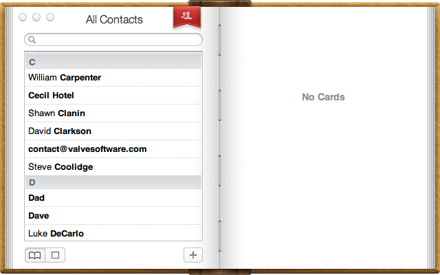
Think about this: An address book is a fine format for the information in real life because you're breaking a long list of seemingly random, but organized data into pages bound by a book. You can flip to any page, look through it by letter, page number, name, phone number, whatever...
However digitally that is not how that information works for my contacts. First, any contact can have an infinite number of data associated with them. This means making a fixed height window to load a scrollable listing of all the data is a really poor way to go about structuring the app.
Second, forcing my list of contact's names into the small left-hand book-page styled window made them far more inaccessible than the real thing. I can't store position, if I have a lot of contacts in a specific letter then I can't go to another name in another letter and come back to that. If there were an actual book that wouldn't be an issue because there's just a page number I can go back to.
Third, limited organization. The aesthetic they chose to match their iOS apps means a big lack in the organizational options. Since it's digital and the data is separated from the visual style of the app, I should be able to have more say in which names get displayed and how they're organized since the data is being pulled from a database. For instance maybe divide my contacts between people, businesses, friends, and family. Since contacts can already store a bunch of key values you would think I could have more than just a business/person option.
Apple needs to really consider how people use their contacts and their related information and then design the app to best suit those needs. Not creating a "realistic" address book background and cramming all information into it.
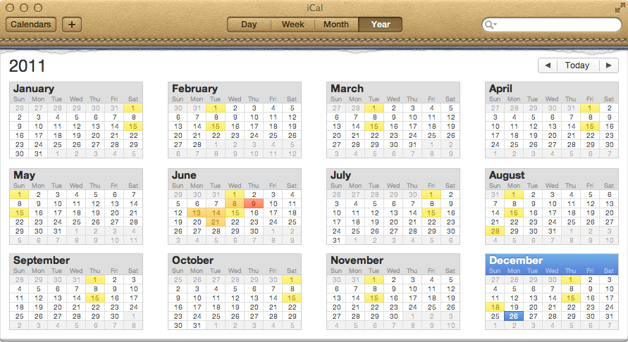
Another app I think apple really missed out on being able to really work with is their iCal app which is the OS X calendar. The older version from pre OS X Lion I used a lot! It was a nice quick way to schedule my meetings and project due dates. In the Lion version they really did two things:
1.) Just arbitrarily changed the aesthetic. The dressings of the app are different. This is the only visual difference. Oh and less information that was useful is displayed. Subjectively it's a really unpleasant design aiming for visual realism on what looks like an old, over-priced calendar from the 1920s.
I miss having a sidebar that would let me instantly know what calendar I was viewing and wouldn't require me to wait for the calendar popup to load so I know which one I'm on which is what plagues the experience with this new OS X Lion iCal.
2.) Made it harder to use. This really ticks me off, IT DOES LESS! You see less information on your events, it's less clear which calendar you're using or working on, it has less options for interfacing with other services & software. There's absolute no consistency in anything!
So again this software would greatly benefit by Apple doing research on how people use or rather, would like to use calendar software and redesign it to suit those needs. Maybe it doesn't need to look like an actual calendar! Start with that? When one writes down an event in a calendar what are they really doing? They're not just marking down descriptive words in a numbered square that represents a day of the month, no! They are preparing for an event, they need to know the time, the place, and when they need to act upon it.